French blue is having a long moment, and unlike most colour trends it is not really new. It is the blue of shutters in Provence, of Delft tiles, of workwear jackets that have been washed two hundred times. Which is the point — it looks like it has always been there.
It is also one of the harder colours to get right, because “French blue” is not a single shade. It is a family, and the members behave very differently depending on which way your windows face. Pick the wrong one and a colour that looked serene on the chip turns cold and slightly purple on the wall.
This is a guide to choosing within the family: what actually defines it, how to read the numbers that predict how it will look, and which shade suits which room.
What Makes a Blue a French Blue
One thing, mostly: a grey undertone.
That grey is what separates French blue from a nautical navy or a coastal sky blue. It softens the colour, keeps it from reading as childish or themed, and lets it sit as a neutral rather than an accent. A French blue room does not shout blue at you. It just feels calm and slightly older than it is.
Underneath the grey there is usually a secondary undertone, and this is where most mistakes happen:
- Purple-leaning. Cooler, moodier, more formal. Beautiful in rooms with plenty of light. In a dark north-facing room it can turn distinctly lilac, which is rarely what anyone wanted.
- Green-leaning. Warmer, softer, more forgiving. These are the safer choice in low light and the better match for wood tones and warm whites.
Before you fall in love with a chip, work out which of those two it is. Hold it against a piece of white paper in daylight — the secondary undertone becomes obvious when it has a true white to sit against.
Learn to Read LRV — It Predicts Everything
LRV is Light Reflectance Value, printed on most paint chips, on a scale of 0 (absolute black) to 100 (pure white). It tells you how much light the colour bounces back, and it is the most useful number on the chip by a distance.
- LRV above 55 — reads as a pale tint. Will look almost white in a bright south-facing room.
- LRV 40 to 55 — clearly blue but still light. The safest range for a whole living room.
- LRV 25 to 40 — properly saturated. Needs decent natural light or good lamps.
- LRV below 25 — dramatic and enveloping. Best on a feature wall, or in a small room you are deliberately making cosy rather than trying to make bigger.
The rule that saves the most disappointment: colour reads roughly two shades darker on a wall than on a chip. Four walls of the same colour reflect into each other and compound. If a chip looks exactly right, the shade one step lighter is usually the one you want.
Window Direction Changes the Colour
The same tin produces genuinely different results in different rooms. This is not subtle and it is the single most common reason a French blue fails.
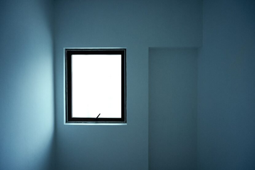
- North-facing — cool, blue-grey light all day. It amplifies the cool in a cool colour. Purple-leaning blues can go lilac here. Choose green-leaning shades, and go lighter than you think.
- South-facing — warm, bright, long hours of sun. Very forgiving. Almost any French blue works, and you can go deeper than you would elsewhere.
- East-facing — warm early, cool from midday. Consider when you actually use the room. A living room used mostly in the evening is effectively a north-facing room.
- West-facing — cool mornings, strong warm light in the late afternoon. Deep blues look particularly good here in the evening.
The Pale End
LRV roughly 50 and up. These behave like a tinted neutral — they read as “not white” more than as “blue,” and they suit rooms where you want light and air rather than drama.
Sherwin-Williams Niebla Azul (SW 9137) is a genuinely useful pale French blue, with a noticeable grey component and a slight purple undertone. LRV is around 52, which puts it just at the point where it stays readable as blue rather than washing out. Worth being careful with it in a north-facing room, where that purple can surface.
Farrow & Ball Borrowed Light (No. 235) is one of the palest blues that still holds its colour. Very soft, slightly cool, and effective in bright rooms where a stronger blue would be overwhelming. In low light it can drift close to white.
Sherwin-Williams Little Boy Blu leans green rather than purple and carries less grey than Niebla Azul, which makes it warmer and more forgiving in dim rooms. A reasonable first choice if you are nervous about the colour going cold.
Pale French blues work best when the trim is a warm off-white rather than a bright white. A stark white next to a pale blue makes the blue look dingy — the contrast flattens it.
The Middle: Where French Blue Actually Lives
LRV roughly 30 to 50. This is the heart of the family and where most successful living rooms land. Unmistakably blue, still light enough for four walls.
Sherwin-Williams Debonair (SW 9139) is about as close to a textbook French blue as a mainstream brand produces — a medium-depth blue-grey with a hint of purple that gives it a slightly stormy quality. It holds its character in varied light and is one of the more reliable choices for a whole room.
Farrow & Ball Lulworth Blue (No. 89) is softer and chalkier, with the powdery quality Farrow & Ball is known for. It reads as period-appropriate in older houses and pairs unusually well with warm woods and brass.
Benjamin Moore Buxton Blue (HC-149) sits in the grey-blue register with a green lean, which makes it one of the safer mid-tones for a north-facing room. Understated rather than dramatic.
If you are painting a whole living room and want it to still feel like a living room rather than a statement, this band is where to look.
The Deep End
LRV below 30. These stop being backgrounds and become the subject of the room. Used well they are the most impressive version of this colour; used carelessly they make a room feel like a corridor.
Benjamin Moore Van Deusen Blue (HC-156) is a deep, slightly muted blue with enough grey to avoid reading as navy. Excellent on a feature wall behind a sofa, and very good on built-in shelving.
Farrow & Ball Stiffkey Blue (No. 281) is darker and more inky, close to navy in low light but with a softness that keeps it from feeling corporate. It is dramatic in evening lamplight, which is when most living rooms are actually used.
Two rules for the deep end. First, these need warm lamp lighting — under cool bulbs they go flat and grey. Second, in a room with limited natural light, painting everything including trim and ceiling in the deep shade works far better than one dark wall among pale ones. Contrast is what makes a dark room feel small; consistency makes it feel deliberate.
What to Put Next to It
French blue is cool and grey-based, so it wants warmth alongside it or the room turns clinical.
Whites and trim
Warm off-whites and soft creams. Avoid bright, blue-based whites — they compete with the blue and make it look dirty. A trim white with a touch of yellow or grey in it will make the blue look richer by contrast.
Woods
Mid and warm woods are the natural partner: oak, walnut, pine that has aged. The orange-warm in wood is close to the opposite of blue-grey on the colour wheel, which is why the combination feels resolved. Cool-toned grey woods tend to make the whole room feel cold.
Metals
Brass and aged gold are the strongest pairing — the warmth cuts the cool directly. Blackened iron works for a more restrained look. Chrome and polished nickel are cold-on-cold and generally make the room feel harder.
Textiles
Natural, textured, undyed: linen, jute, wool, rattan. Texture matters more than pattern here, because a flat blue wall needs something with surface interest opposite it. A cream bouclé or a heavy linen does more for the room than a patterned cushion.
Accent colours
Rust and terracotta are the classic counterweight — directly warm, directly opposite. Mustard and ochre work similarly. Soft sage keeps things quiet and tonal. Blush pink is the unexpected one that works, particularly with the paler blues.
Finish Matters More Than People Expect
The same colour in two finishes can look like two colours, because sheen changes how much light bounces back.
- Matte / flat — deepest colour, hides wall imperfections, marks easily. Best for the deep shades, where you want the colour to absorb rather than reflect.
- Eggshell — slight sheen, wipeable, the default for living room walls. Reads slightly lighter than matte.
- Satin — noticeable sheen, durable. Better on trim and doors than on large wall areas, where it shows every ripple.
- Semi-gloss — trim, doors and built-ins only.
For most living rooms: eggshell on walls, satin or semi-gloss on trim, in the same colour or a warm off-white.
Which Walls, and How Much
Three approaches that reliably work:
All four walls, mid-tone. The most cohesive result. Choose from the LRV 30 to 50 band, keep the trim a warm off-white, and let furniture provide contrast.
One deep feature wall. Works when the wall has a purpose — behind the sofa, around a fireplace, the wall with the shelving. A dark wall chosen at random reads as unfinished. Keep the remaining walls warm rather than bright white.
Colour-drenched. Walls, trim, ceiling, sometimes built-ins, all in the same shade. Sounds extreme and is unusually effective in smaller or darker living rooms, because removing the contrast between wall and trim removes the visual boundaries that make a room feel boxed in. This is the approach that suits the deep end best.
Test Properly, or Do Not Bother
Paint chips are close to useless for a colour this sensitive to light. The extra step is worth it every time.
- Get sample pots, not chips. Paint two coats on white poster board, roughly A3 or larger. Board rather than the wall means you can move it.
- Leave a white margin around the edge of the board so the colour has a reference point.
- Move it to every wall in the room. The wall opposite the window and the wall beside it will look different.
- Look at it at three times: morning, mid-afternoon, and at night under your own lamps. The night check is the one people skip and the one that matters most for a room used in the evening.
- Wait 48 hours. Colour perception shifts as your eye adjusts, and first reactions are unreliable.
Two or three sample pots cost a fraction of repainting a room, and this colour family punishes guessing more than most.
Mistakes That Come Up Repeatedly
- Ignoring window direction. The main cause of French blue going lilac or grey. North-facing rooms need green-leaning shades.
- Bright white trim. Makes the blue look dull and slightly dirty. Warm off-white instead.
- Cool bulbs. 4000K lighting drains the colour out of blue-grey entirely. Use 2700K.
- Going too dark in a dark room. If you want deep colour in a low-light room, drench everything rather than doing one dark wall.
- Judging from a chip. Chips are too small and are viewed against the wrong background. Sample boards, always.
- Cool metals throughout. Chrome and nickel with a cool blue produces a room nobody wants to sit in. Add brass somewhere.
Frequently Asked Questions
What colour is French blue?
A medium blue with a distinct grey undertone, usually with a secondary lean toward either purple or green. The grey is what defines it — it is softer and more muted than navy or sky blue, which is why it functions as a neutral rather than an accent colour.
Is French blue good for a living room?
Yes, particularly in the LRV 30 to 50 range, which is saturated enough to read as a colour but light enough for all four walls. It works as a background rather than a statement, which is what most living rooms need.
What is the best French blue paint colour?
It depends on your light more than on the paint. Sherwin-Williams Debonair is a reliable mid-tone for varied light; Farrow & Ball Lulworth Blue suits period rooms and warm woods; Benjamin Moore Buxton Blue is the safer pick for north-facing rooms because it leans green. Always test with sample boards before committing.
What colours go with French blue?
Warm off-whites, mid and warm woods, brass, and natural textiles like linen and jute. For accents, rust, terracotta, mustard and soft sage. Avoid bright blue-based whites and cool metals like chrome, which make the room feel cold.
Does French blue make a room look smaller?
The pale and mid shades do not — anything above LRV 40 keeps a room feeling open. Deeper shades do visually enclose a room, but that is not automatically a problem. Colour-drenching a small room in a deep blue often makes it feel intentional and cosy rather than cramped.
Why does my blue paint look purple?
The shade has a purple secondary undertone and your room’s light is cool, most likely north-facing. Cool light amplifies cool undertones. Switch to a green-leaning blue, warm the artificial lighting to 2700K, and add warm elements — wood, brass, cream — to counterbalance.
What sheen should I use for living room walls?
Eggshell for walls, satin or semi-gloss for trim and doors. Matte gives the richest colour and suits deep shades but marks easily, which is a real consideration in a room that gets daily use.
The Short Version
Work out which way your windows face before you look at a single chip. North-facing, go green-leaning and lighter. Stay in the LRV 30 to 50 band for four walls. Warm off-white trim, warm bulbs, brass somewhere, wood somewhere. Test on boards, look at night, wait two days.
Get the undertone and the light right and this is one of the most forgiving colours there is. Get them wrong and it is one of the least.
Paint colours and codes are provided as a starting point. Formulations and ranges change — confirm current codes with the manufacturer, and always test in your own room before buying.