English cottage style has a reputation problem. Say the words and half of people picture something genuinely lovely — layered florals, worn wood, a bed you would want to be ill in — and the other half picture a gift shop.
The difference between the two is not budget or authenticity. It is restraint, and specifically knowing which elements to keep and which to leave in the reference photo. A cottage bedroom in a modern house does not need beams, a thatched roof or a four-poster. It needs about four things done properly.
This covers what actually defines the style, how to translate it into a house built after 1980, and where the line is between charming and twee.
What the Style Actually Is
English cottage interiors evolved from necessity rather than design. Small rooms, low ceilings, limited light, furniture acquired over generations rather than bought as a set. Nothing matched because nothing was chosen together.
That origin explains every characteristic of the look:
- Accumulation, not curation. Pieces from different periods, in different woods, at different levels of wear. The room looks like it happened rather than like it was installed.
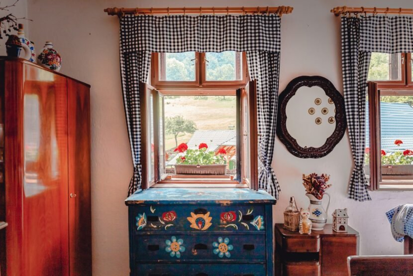
- Pattern used as texture. Florals and small prints on multiple surfaces at once, which works because the prints are small enough to read as texture from across the room.
- Soft, chalky colour. Historic pigments were muted. Nothing in a genuine cottage palette is fully saturated.
- Visible age. Worn edges, patina, wood that has been repaired. Perfection is the opposite of this style.
- Comfort over drama. Deep bedding, heavy curtains, upholstery you sink into.
The version that goes wrong is the version that skips the accumulation and buys a matching cottage-themed set. Everything matching is precisely what a cottage was not.
The Palette Is Softer Than You Think
The most common mistake is going too saturated. Cottage colour is chalky, dusty and slightly greyed — it looks faded even when new.
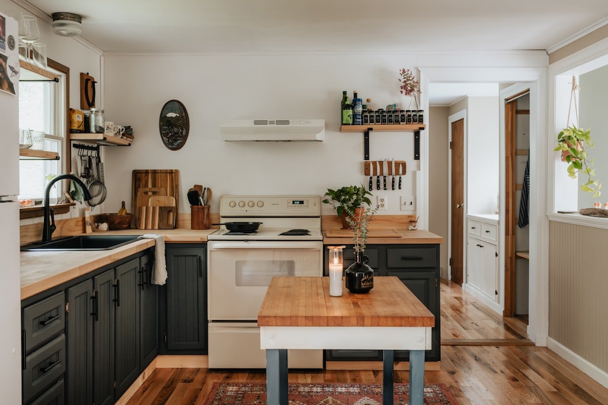
Base colours for walls: warm off-whites, soft cream, muted sage, powder blue, pale rose, dove grey. Nothing bright. Whites should have a yellow or grey base rather than a blue one, or the room turns cold, which undoes the whole point.
Mid tones for textiles and painted furniture: dusty rose, sage green, muted mustard, faded terracotta, soft ochre.
Depths, used sparingly: forest green, plum, deep burgundy, dark teal. These belong on a single piece of painted furniture, an interior door, or one wall — not throughout.
A useful test: if a colour would look at home on a piece of well-worn painted furniture from a hundred years ago, it fits. If it looks like it came from a current paint trend, it probably does not.
On white walls
Modern houses often have white walls already, and the instinct is to keep them. It works, but only if the white is warm. A cool builder-grade white against cottage textiles makes the textiles look dingy. Repainting in a warm off-white is the single highest-impact change in a modern room, and it costs a tin of paint.
Pattern, Which Is the Hard Part
Pattern is what makes the style and it is where most attempts fail. The rule people are missing is that cottage pattern mixing is not random — it follows a structure.
Vary the scale
The single most useful rule. Use three patterns at three different scales:
- One large-scale pattern — a substantial floral, on curtains, a headboard, or one wall
- One medium — a check, stripe or medium floral, on the duvet or cushions
- One small — ditsy floral, small dot, tiny geometric, on accent cushions or a lampshade
Three patterns at the same scale fight. At different scales they read as layered. This is the whole trick, and it is why the reference photos look effortless and a first attempt often does not.
Hold the colour steady
The patterns can be entirely different in subject and still work if they share a colour family. A rose floral, a green check and a small sage print work together because green and rose run through all three. Introduce a fourth unrelated colour and the room falls apart.
Practical approach: pick your large-scale pattern first, take three colours out of it, and choose everything else from those three.
Add a plain
Every patterned room needs somewhere for the eye to rest. Plain linen, a solid throw, an unpatterned rug. Roughly one third of the soft furnishing in the room should have no pattern at all.
Chintz, carefully
Traditional glazed floral chintz is having a revival and is the fastest route to either the best or worst version of this style. It works on one surface — curtains, a headboard, a single chair. It does not work on curtains and bedding and cushions, which is the point at which a bedroom becomes a gift shop.
The Bed Itself
The bed carries the room. It does not need to be antique.
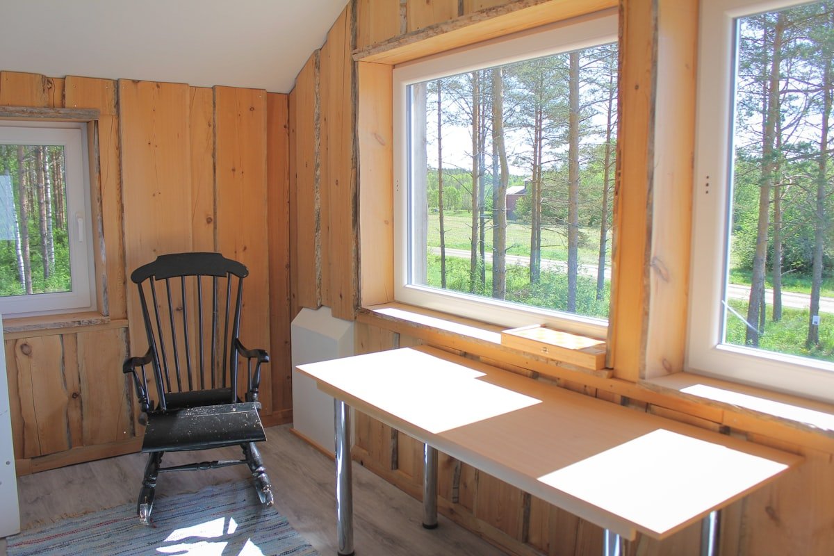
Frames that work
A simple iron or brass frame is the most reliable choice — period-appropriate, widely available second-hand, and it suits a modern room because it is visually light. A painted wooden frame works too, ideally in a muted colour with visible brush texture rather than a sprayed finish.
A four-poster is authentic and usually wrong in a modern house with standard ceiling heights. It needs the height to breathe, and at 8ft it dominates rather than furnishes.
An upholstered headboard in a large-scale floral is the modern translation that works best — it delivers the pattern and the softness without any period furniture at all.
Layering the bed
Cottage bedding is deep. The structure:
- Plain or small-print fitted sheet
- A flat sheet, turned down over the duvet — this small detail reads as traditional more than almost anything else
- Duvet or eiderdown in the medium-scale pattern
- A quilt or knit blanket folded across the lower third
- Pillows in mixed sizes: two large, two standard, one or two small in the small-scale print
Mixed pillow sizes matter. Matching pillows in matching cases is a hotel bed. Cottage beds look assembled from what was to hand.
Where to save
An eiderdown or quilt is the item worth finding second-hand. Vintage quilts turn up in charity shops and online marketplaces for a fraction of new reproduction pricing, and the genuine wear is exactly the quality that new ones try to imitate.
Furniture: Mismatched on Purpose
Buying a matching bedroom set is the fastest way to lose the look entirely.
What to aim for instead:
- Different woods. Oak, pine, walnut in one room is correct, not a mistake. Warm woods over cool greyed ones.
- Different periods. A Victorian chest, a mid-century chair and a new bed frame is a perfectly cottage combination.
- Painted and unpainted together. One or two painted pieces among bare wood, ideally with wear at the edges where hands would have touched them.
- Nightstands that do not match each other. A small chest on one side, a table on the other. This is one of the clearest signals of the style and it costs less than buying a pair.
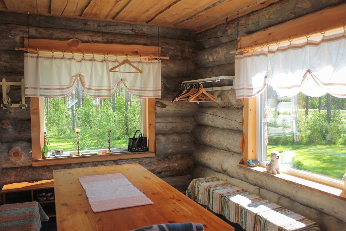
For sourcing: charity shops, marketplace listings, auction houses and skips. Solid wood second-hand furniture is frequently cheaper than new flat-pack, and it is the right material.
A caution on painting antiques — do not paint anything genuinely good. Painted-over solid wood loses value and, more relevantly, the bare wood is usually what the room needs.
Windows and Light
Cottage windows were small and the treatments were generous, which is the reverse of the modern instinct.
Curtains rather than blinds, floor length rather than sill length, in a heavier fabric than seems necessary. Hang the rod high and wide — above the frame and extending past it — so the window looks larger and the fabric has somewhere to stack.
Gathered headings suit the style better than pleated ones. A simple gathered tape reads as domestic rather than tailored, which is right.
Where curtains are not practical, a fabric Roman blind in a small print achieves most of it. Avoid hard modern blinds, which are the single most jarring modern element in an otherwise cottage room.
Lighting
Cottage bedrooms had no overhead lighting, and the modern version works best when it pretends the same. Two or three lamps, warm bulbs at 2700K, positioned low.
Fabric shades over glass or metal. A pleated or gathered shade in a small print is a cheap and disproportionately effective detail — it delivers pattern, softens the light, and costs very little.
Avoid: recessed downlights used as the main source, anything chrome, anything cool-toned.
Translating Into a Modern House
The real question for most people. A 2005 bedroom with flat plaster, a radiator and a fitted wardrobe is not a cottage, and pretending otherwise is where things go wrong.
What transfers
- The palette — works anywhere
- Pattern mixing — works anywhere
- Layered bedding — works anywhere
- Mismatched furniture — works anywhere
- Warm low lighting — works anywhere
- Generous curtains — works anywhere
What does not
- Fake beams. Applied polystyrene or thin timber beams on a flat modern ceiling read as false immediately. This is the clearest single marker of a themed room rather than a decorated one.
- Fake stone or brick cladding. Same problem.
- Reproduction “vintage” signage. Distressed signs with cursive text belong to a different and more commercial style.
- Everything matching from one cottage-themed range. Defeats the point.
The four-thing version
If you do nothing else in a modern bedroom:
- Warm off-white on the walls
- Three patterns at three scales, sharing a colour family
- Two mismatched nightstands with two lamps in fabric shades
- Floor-length curtains hung high and wide
That is a convincing cottage bedroom in a modern house, with no architectural changes at all.
The Darker Version
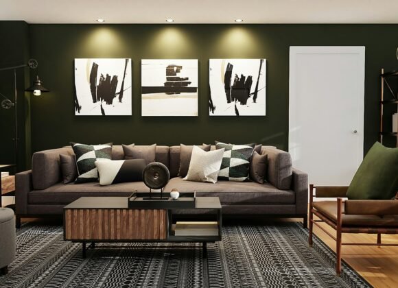
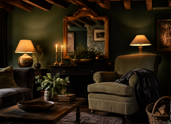
There is a moodier strand of this style — sometimes filed under goth farmhouse or dark cottage — and it translates unusually well into modern rooms, because it drops the elements that read as twee.
Same structure, different register:
- Deep walls. Forest green, aubergine, charcoal, oxblood, rather than pale neutrals. Colour-drenched including trim works particularly well.
- Dark florals. Same florals, on a black or deep ground rather than cream. This is the defining move of the whole look.
- Darker woods and blackened iron rather than brass.
- Heavier textiles. Velvet alongside the linen and cotton.
- Sparser objects. The dark version tolerates far less clutter than the pale version, and needs more empty surface.
It needs good lamp lighting more than the pale version does, and it suits north-facing or low-light rooms where a pale cottage scheme would just look grey. If the traditional palette feels too sweet, this is the same style with the sugar removed.
Doing It Cheaply
This style is well suited to a small budget, because worn and mismatched is the goal rather than a compromise.
- Charity shops and marketplace for furniture, frames, lamps and mirrors. Solid wood is often cheaper than new particleboard.
- Vintage textiles — quilts, eiderdowns and tablecloths. Old floral tablecloths make excellent cushion covers and cost a few dollars.
- Remnant fabric from upholstery shops for cushions, lampshades and small curtains. Often sold by weight.
- Paint one piece rather than buying new. A tester pot covers a nightstand.
- Recover an existing lampshade with a small-print fabric rather than buying one.
- Foraged and dried flowers rather than bought arrangements. Dried hydrangea and grasses last years.
A convincing version of this room is achievable for $200 to $300 if the furniture is second-hand, which is less than a single new bedroom set.
Where It Goes Wrong
- Too much pattern, no plain. A third of the soft furnishings need to be unpatterned.
- All patterns at one scale. Vary large, medium and small.
- Saturated colour. Cottage colour is chalky and greyed, never bright.
- Cool white walls. Makes every warm textile look dirty.
- Fake beams. The clearest marker of a themed room.
- Matching everything. Mismatched is the entire premise.
- Too many small objects. Accumulation means furniture and textiles, not ornaments on every surface.
Frequently Asked Questions
What is English cottage style?
An interior style based on small rural English homes, defined by mismatched furniture from different periods, layered floral and check patterns, soft chalky colours, worn natural materials and deep comfortable textiles. It reads as accumulated over time rather than decorated at once.
How do I mix patterns in a cottage bedroom?
Use three patterns at three different scales — one large, one medium, one small — and keep them in a shared colour family. Pick the large-scale pattern first and draw the other colours from it. Leave about a third of the soft furnishings unpatterned so the eye has somewhere to rest.
Can I do cottage style in a modern house?
Yes. The palette, pattern mixing, layered bedding, mismatched furniture, warm lamp lighting and generous curtains all transfer to any room. What does not transfer is applied architectural detail — fake beams and stone cladding read as false on modern surfaces and are the clearest sign of a themed room.
What colours suit an English cottage bedroom?
Warm off-whites, cream, muted sage, powder blue and pale rose for walls. Dusty rose, sage, muted mustard and faded terracotta for textiles. Forest green, plum or burgundy for a single piece of furniture or one wall. Everything chalky and slightly greyed rather than saturated.
What is goth farmhouse or dark cottage style?
The same structure with a darker palette — deep green, aubergine or charcoal walls, florals on black grounds instead of cream, darker woods and blackened iron. It suits low-light and modern rooms well, and avoids the sweetness that puts some people off the traditional version.
Do I need antique furniture for a cottage bedroom?
No. What matters is that pieces do not match each other — different woods, different periods, mismatched nightstands. Second-hand solid wood is often cheaper than new flat-pack, but a new frame among older pieces is entirely consistent with the style.
How do I stop cottage style looking twee?
Limit chintz to one surface, keep a third of the room unpatterned, skip reproduction signage and fake beams, and resist filling every surface with small ornaments. If it still feels too sweet, shift to the darker palette, which keeps the structure and removes the sentimentality.
The Short Version
Warm off-white walls. Three patterns at three scales in one colour family, with a third of the room left plain. Nightstands that do not match, lamps with fabric shades, curtains to the floor hung high and wide. Second-hand wherever possible, because worn is the point.
No beams required. The style was never about the architecture — it was about a room full of things that arrived at different times and learned to get along.