

Earth tones are having a moment. Terracotta, warm brown, rust, sage, and ochre have replaced the cool grays and stark whites that dominated interior design for most of the 2010s.
But there is a reason a lot of earth tone rooms look muddy, heavy, or like the inside of a 1970s vacation cabin. Getting earth tones right requires understanding which shades work, how to combine them, and what to use as a counterbalance. This guide gives you a system that actually works, not just mood board inspiration.
What Are Earth Tones?
Earth tones are colors derived from natural pigments found in soil, clay, stone, sand, and plant matter. They are inherently warm — they pull toward red, yellow, and orange rather than blue and green.
The core earth tone palette includes:
- Terracotta — burnt orange-red, named after fired clay
- Ochre — golden yellow, one of the oldest natural pigments
- Warm brown — ranging from tan and caramel to deep chocolate
- Rust — deep, oxidized orange-red
- Warm taupe — greige with a distinctly warm undertone
- Sage green — muted, gray-green; sits at the edge of the earth tone family
- Sand and cream — light neutrals that anchor deeper earth tones
- Warm charcoal — dark brown-black, used as a grounding shade

The Core Rule: 60-30-10 With Warm Neutrals as the Base
Earth tone rooms fail when every surface is a different warm color. Brown walls, terracotta cushions, rust curtains, and ochre rugs fight each other and create visual noise. The 60-30-10 rule solves this:
- 60% dominant color: A warm neutral — sand, cream, warm white, or warm taupe. This is your walls, large upholstery, or flooring.
- 30% secondary color: One stronger earth tone — terracotta, warm brown, or sage. This appears in large accents: a sofa, armchair, curtains, or a large rug.
- 10% accent: Your boldest earth tone — rust, ochre, deep brown, or a dark clay. This is cushions, small ceramics, a throw, art.
Most successful earth tone rooms are actually mostly neutral, with concentrated pops of deeper color. If your room feels muddy, the dominant color is probably too saturated.
Room-by-Room: Earth Tones Interior Design in Practice
Living Room

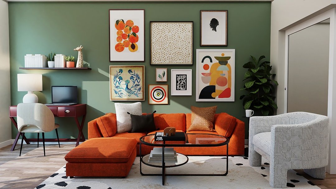
Start with the sofa. A terracotta, warm camel, or sage green sofa is the single most impactful earth tone investment you can make. It anchors the room’s color identity while everything else can be relatively neutral.
Use the rug to lay the foundation. A jute or sisal rug in natural beige provides texture and warmth without competing with other colors. A printed rug with terracotta, brown, and cream tones works as the blueprint for your whole color scheme — pull accent colors from the rug rather than choosing them separately.
Keep walls in the light neutral range. Warm white, pale sand, or a very light clay — not bright white, which reads as cool next to warm furnishings. Farrow and Ball’s “String” or “Joa’s White,” Benjamin Moore’s “White Dove” or “Pale Oak” are reliable choices.
Bedroom

Terracotta is the easiest accent wall color. Paint one wall — typically behind the headboard — in terracotta. Pair it with warm white on the remaining walls, linen bedding in cream or oatmeal, and wooden furniture.
Ochre makes a better accent than a dominant color. A single ochre throw or a pair of ochre cushions warms a bedroom without tipping it into excess. Ochre as a wall color, unless very muted and desaturated, tends to overwhelm.
Kitchen and Dining Room
Cabinet color is the biggest lever. Warm sage green, warm taupe, or a muted terracotta on lower cabinets with warm white upper cabinets is a combination that works reliably. If painting cabinets is out of scope, swap chrome pulls for unlacquered brass, matte bronze, or antique brass — these metals read as warm and earthy.
Dining rooms accept darker earth tones better than other rooms. A deep warm brown, rich terracotta, or warm rust on dining room walls creates an intimate atmosphere that works well for a room used primarily in the evening.
Bathroom

Bathrooms present a specific challenge: they tend to be small, which makes dark earth tones risky. Terracotta and sand work best with good natural light. Accessories do most of the work — warm-toned stone, terracotta soap dishes, ceramic dispensers in matte brown, wicker baskets, wooden holders.
The Mistakes That Make Earth Tone Rooms Look Dated
Mixing warm and cool tones. Earth tones are warm. If you mix them with cool gray, slate blue, or bright white, the two palettes fight each other. Keep everything warm or everything cool.
Going too dark without enough light. A room with terracotta walls, brown furniture, and rust cushions absorbs a lot of light. If your room lacks strong natural light, use earth tones primarily in accents and keep walls and large surfaces in the lighter neutral range.
Choosing saturated versions of earth tones. The colors that read as sophisticated are muted and slightly desaturated. When choosing paints or textiles, look for words like “dusty,” “muted,” “clay,” “antique,” or “vintage” in the color name.
Earth Tones With Wood and Metal
Warm-toned woods — walnut, cherry, warm oak — support an earth tone scheme. Cool-toned or grey-washed woods fight it. For metals: unlacquered brass, matte gold, aged bronze, and antique copper belong in earth tone rooms. Chrome, nickel, and polished stainless do not. Matte black is the exception — it reads as dark charcoal-brown rather than a cool tone.
Key Takeaways
- Earth tones are warm-based: terracotta, ochre, rust, warm brown, sage, sand
- Use the 60-30-10 rule: mostly warm neutral, one stronger earth tone, small accents of the boldest color
- Muted, desaturated versions of earth tones read as sophisticated; saturated ones look dated
- Keep metals warm — brass, bronze, matte gold — and avoid chrome and polished nickel
- The biggest mistakes are mixing warm and cool tones, going too dark, and using only brown
For more on bringing nature into your home, read our guides on natural elements interior design and earthy interior design.


